A Single Spotlight

Throughout the process of Three Words not only was I the Production Manager, but I also took on the role as Lighting Designer (LD). Unlike a scripted play, our company devised the performance from scratch so I wasn’t able to go through our script from day one and think about ideas for lighting the stage, frankly because we did not have a finished script until a few weeks before the performance. When taking on a devised piece of work, this is something that a LD especially, has to deal with. Instead, I had to write notes down when scenes were first created and developed about the atmosphere and the intentions of the scene, so I could slowly put together a lighting design.

Francis Reid states that “the lighting designer is not some rather grand person who appears towards the end of the rehearsals and implies: ‘Right! You, Director, have done your production bit and you, Designer, have done your scenic bit. Stand aside and I will light the result of your (pathetic) efforts!” (2001, p. 90). The LD is in fact a part of the production team and communicates with the Director. Ultimately, the LD gives the director what he wants. All the way through the process I arranged meetings with Tom (Director) and Shellie (Stage Manager) to discuss ideas of what his initial vision of his production was. He opted for a production that was exciting, fun and visually stimulating. The first idea that sprang to my mind was adding lots of colour. The most important thing to remember when adding colour to lights is to “determine what role colour will play in the production style” (Reid 2001, p. 77). We need to think, ‘what do these colours represent?’ and ‘will a certain colour portray a certain emotion?’ For Three Words, I suggested a colour scheme of blue, purple, pink, green and orange, instead of always utilising straightforward white lights. These colours do not each represent an emotion necessarily; in fact they were not even used to create a tense or happy atmosphere. When blended together, these colours formed a visual picture that was vibrant and hopefully intriguing for the eye of the audience. When discussing colours with the Director, we agreed that having such a range of colours also essentially portrayed the range of stories and situations we put into our production. I even managed to take our company colours pink and green (from our programmes and posters) and light our pre-set with them. Below are some photos taken during our technical rehearsal in the Lincoln Performing Arts Centre auditorium & attached are my Magic and Focus sheet:
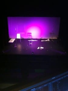
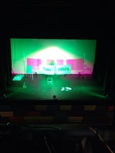
 

(Taken by Abigail Dawson: 22/05/14)

NO ADDED SUGAR FOCUS CHART

NO ADDED SUGAR MAGIC SHEET

Like Brecht, we utilised some of the methods which he created for Epic Theatre. Such as our flipchart with three words that described each scene, this resembles Brecht’s use of placards which also explained each new scene. He basked in the fact that the audience were aware they were watching actors performing a play, set changes would be in full view. I was also influenced by how he employed his lighting on stage. Many of his lights were visible to the audience, much like ours, and even our operator was on stage with us which eliminated any impression of a naturalistic feel. His use of lighting would indicate a passing of time or a chance in scenes, which is exactly what I aimed to use ours for. We did not necessarily require the lights to create a mood or atmosphere, if colour was added during a scene it would be to suggest a change in tone or pace of the dialogue, not a change in the actor’s emotions. Fundamentally, “Brecht wanted above all a space to tell his story in” (Leach 2004, p. 123) which I believe I also created with my lighting design plans.

Another influence I encountered during our process was Headlong Theatre Company. I believe their lighting design, fantastically created by Malcolm Rippeth in many of their productions, transports their audience into a scene. They use colour, generally subtle, but which enhances the mood and atmosphere of a production. Below are photographs from their current production of Spring Awakening (2014) and past production of Chimerica (2013):

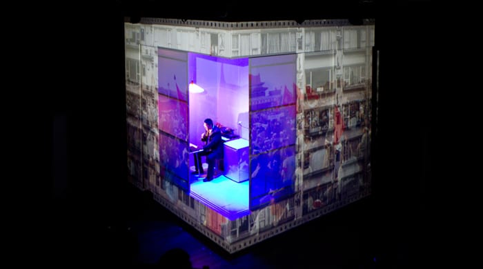
springawakening
CHIMERICA-WEB-15 (Taken from https://headlong.co.uk)

I sought to take an essence of Headlong’s lighting and create our own style. Something that was bright and colourful, something that the audience would visually enjoy. I have thoroughly enjoyed my role of Production Manager, however my passion lies in designing lights. I can only hope this showed through our production of Three Words. If I have any three words to say its: Watch this space. Below are some photos taken from our dress rehearsal which show some of my colourful lighting design in action on the stage:
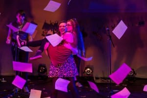
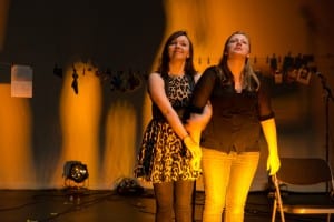
14129840867_11967495a5_b
(Taken by Linford Butler: 27/5/14)
14316389635_82134916bd_b
(Taken by Linford Butler: 27/5/14)


Works Cited
Reid, F. (2001) The Stage Lighting Handbook, New York: Routledge.
Leach, R. (2004) The Makers of Modern Theatre: An Introduction, London: Routledge.
Chair Duets

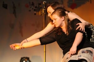
Our performance is now just over two weeks away and so we have been blocking the last few smaller scenes this week and we pretty much have a full show (woohoo!). One of the last scenes we have put together has been inspired by Frantic Assembly’s Chair Duets and adds a new element to our already very eclectic performance style.

The scene we have made combines three recordings of verbatim with three separate movement sequences. We took the essence of Frantic Assembly’s Chair Duets: the nature of the action/reaction and the “firm and deliberate” (Graham and Hoggett, 2009, 141) movement are the main two similarities between our work and theirs.  However, once we had got to grips with the rules of the chair duets we decided to break quite a lot of them to adapt the style to our own performance. Firstly, one of the sequences does not use chairs at all and another only uses one. Although this breaks the fundamental rule of chair duets (which are supposed to be performed with two chairs facing outwards), we found that we could perform a wider variety of moves. Secondly, we are using the duets to tell the stories being recalled in the verbatim whereas traditional chair duets should not have a story behind them. We have also slowed our movements down in places which contrasts with Frantic Assembly’s routines that are “played at quite a mesmerising speed” (Graham and Hoggett, 2009, 141).

14305389504_42d8aa4c06_h
Our chair duet

Despite these differences, the influence of the chair duet is pretty clear in all three sequences and has been a helpful springboard in developing our ideas. Our duets communicate the same messages of “touches, embraces, flirtations, rejections” (Graham and Hoggett, 2009, 141) as original duets do and all of these actions and emotions play an important part in the three verbatim stories that we have collected. The chair duet has become for us a way to capture the ups and downs of first dates and relationships in a very simple but physical and visually interesting way.


Works cited:

Frantic Assembly (2009) Frantic Assembly Book of Devising Theatre – Chair Duets. [online] Available from  https://www.youtube.com/watch?v=LC-dkYZOUVo [Accessed 11 May 2014].

Graham, S. and Hoggett, S. (2009) The Frantic Assembly Book of Devising Theatre. London: Taylor & Francis Ltd.


When I fell in love with the film ‘One Day’

One_Day_film_review

(Brooker, 2011)

A couple of days ago, I watched the film ‘One day’ and fell in love with it straight away, I was expecting a very typical Romantic comedy but what I got what something completely different. I first noticed that is was a Film 4 film, which instantly excited me as I knew straight away I wouldn’t be in for a typical love story. Film 4 have also produced other contemporary films such as ‘This is England’ where Shaun Meadows shows the “struggle of a portrait of working-class life” (Ebert, 2007). The story shows real story’s about real people, not sugar coating with a happy ending.


large_wVc7lwmTgDN7QY4G9V8dfYynDec

(Ebert, 2007)

“One day is that reality is rarely what we were expecting” (Brooker, 2011). David Nicholls the writer of the novel ‘One day’ likens his book to “flicking through a photo album” (Brooker, 2011) (which is a very similar effect that we are trying to create) it does not conform to a typical love story they meet, they fall in love, babies and marriage etc. It shows a real relationship between two people that at times hate each other. An example of this reality the film sets out to portray is the fact that we don’t even see the night when the couple finally have sex, the only thing that is shown is its consequences. This reminds the audience that the sex really isn’t that important, it isn’t what defines the relationship and its consequences can ruin a friendship. There are arguments and conversations in the film that the audience can really relate to. This style and reliability is the effect we are aiming to create in all of our writing. I instantly thought of our theatre company when watching this film, as we don’t want to miss out any of the hard bits in a relationship, we want the audience to think ‘Yes that’s what I do’ we want to tell the stories that at times probably aren’t as interesting as two people falling in love at first sight but this doesn’t mean they are not important and don’t have the right to be told!


Works cited

Brooker, W. (2011) Film review: One Day [online] London: At the heart of the education debate. Available from: http://www.timeshighereducation.co.uk/417189.article [Accessed 4 April 2014].

Ebert, R. (2007) This is england review [Online] London:RogerEbert Avaiable from http://www.rogerebert.com/reviews/this-is-england-2007 [Accessed 6 April 2014]