What constitutes a brand? Well, first you need a strong visual identity: logo, fonts, colors, a catchy tagline – but that is not enough. A successful brand engages on an emotional level – it is all about the customers’ experiences with your company (Goldbogen, 2011, 42).

Once we had our logo finalised, we needed to get thinking about our essential marketing tools – poster and flyer designs. As it was the early stages of the process, and the piece is devised, the performance was changing and evolving daily. Theatre in general is recognised as something that is difficult to brand and market: “Difficult brands have two primary characteristics: constrained availability and uncertain outcomes (Harrison and Hartley, 2007) … Uncertain outcomes relates to the risk involved in attending a performance without prior knowledge of how it will be received” (Preece and Johnson, 2011, 19). As we have no credit to the piece, such as reviews or Arts Council funding, it is even more essential that we got the marketing the best it can be to attract an audience. After a group discussion, we decided on a marketing strategy involving post-it notes. We liked the idea of hand-written type, alongside the layering and jumble of the notes. It connected very well to the fragmented and post-structuralist form of theatre that inspired us in the beginning of the process. We planned to write questions on each post-it and stick them around campus and in town. We would ask questions similar to that of our interviews to collect verbatim material, such as “how long should you wait before you say ‘I love you’?” Beneath the question would be a link to our twitter page, in the hope that people would tweet us their answers, with the hash-tag ‘threewords’.
This scheme was in the pipeline, but we felt it was too early to begin as we didn’t have posters and flyers in place. Inspired by the post-it note idea, we decided to create an image of a heart using them. This would make our branding consistent, and the post-it note would be recognisable in relation to No Added Sugar. We particularly liked the contrast of the heart, something traditionally associated with love, made up of something quite ordinary.

We forwarded the images to our graphic designer. We were regrettably vague with our guidelines as we still had not come to a decision as a group on exactly what we wanted, but felt we needed a draft of something to work with.
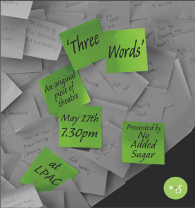
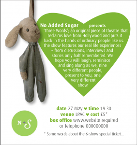
At around the same time, Craig Morrow (the artistic director of Lincoln Performing Arts Centre) needed copy and an image to put in the assessment brochure. We used the image below as it was consistent with the initial poster and flyer designs. Th hand written title added to the ‘home-made’ vibe that we particularly wanted to pride ourselves on, and the blurred writing at the edges was just a little ambiguous and provoking.

Though the current flyer and poster draft were connected to the company through the colour palette and supported our marketing scheme, there was something quite uninspiring about the post-it’s for the poster and flyer. The grey on the face of the flyer made it feel quite pessimistic and cold. It just was not the tone we wanted to create. Additionally, the post-it note heart could have looked brilliant if we had very large posters so the detail could be seen, but was not nearly as striking in A4 or A3 size unfortunately.
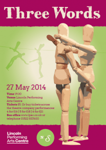
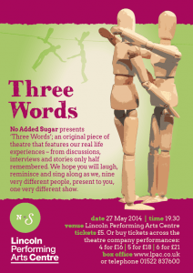
As rehearsals continued we stumbled upon another image. It was suggestive of the theme of love, and the way we planned to deal with it on stage, but still rouses curiosity to find out more. We hoped it would entice an audience far more effectively.

Two inanimate, gender neutral objects, intimately hugging. We all felt there was really something beautiful about that. It also connotes what we are doing with romantic relationships, stripping away the hollywood romance, and leaving the bare bones of what we all experience in reality.
We forwarded this image, with a much clearer brief to the graphic designer, and they hastily began work. We then needed to change the image we had sent to Craig Morrow so it would be consistent with the posters and flyers. We had just missed the deadline, but I went directly to his office to see if it was too late to change the image. I was told that as long as I sent it by the following day it would be absolutely fine. Unfortunately, despite sending it in time, there was some miscommunication in their department and the new image was not used. By the time we had noticed the assessment brochure had gone to print. As had our posters and flyers. We were then in a position with our essential marketing tool having the mannequin image, and the publicity within the venue having something quite different.
With the advice of Diane Dubois, we soon settled upon trying to interweave the two themes. We have begun pushing the post-it note marketing scheme, posting them in and around campus and regularly tweeting about them to create interest. We are continuing to use both images, such as the homepage of this blog site, so that both the mannequins and post-its become recognisable to our company. Web-based marketing, such as social media and websites, are becoming more widely celebrated as an integral marketing tool.
Web-based tools will be seen as complementary to traditional methods. In time, they will replace some of the traditional methods and become more central to organizations’ efforts to engage their audience members between performances and to cultivate and enhance relationships between audience members and the organization itself (Preece and Johnson, 2011, 30).
Online we can more effectively, and instantly, collaborate the two strands and become a consistent presence to our potential audience.
We have certainly learnt a lot from this issue. More urgency and attention should have been paid on how we connect with our audience, and what with, not just making material to perform. Perhaps we should have continued with the original poster and flyer design, but we were willing to take a risk and use an image that we felt really represented the company we had become and the performance our audience will see.
Works Cited
Goldbogen, T. (2011) Re-Imagining a Brand. TYA Today, 25 (2) 42-44.
Preece, S. B. and Johnson, J. W. (2011) Web Strategies and the Performing Arts: A Solution to Difficult Brands. International Journal of Arts Management, 14 (1) 19-33.